
The software is mobile too
The administration runs in the browser. Creating properties, answering enquiries, checking appointments: all of it from a tablet or smartphone at the client's.


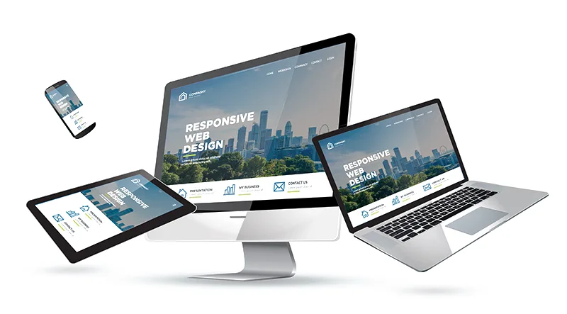
One website, every screen size
With immoprofessional, texts, images and navigation adapt automatically to the device. You maintain your content once.
The e-mails sent from the software, such as exposés and newsletters, are responsive as well. Your prospects read them just as well on a smartphone as on a computer.
The administration runs in the browser. Creating properties, answering enquiries, checking appointments: all of it from a tablet or smartphone at the client's.
You design your website once. Colours, logo and sections apply on every device, without a second version.
More about web designResponsive web design is part of every immoprofessional website and included in the monthly price. It does not need to be set up or booked.
Set up your website in the free trial version and open it on any device. 30 days free of charge and without obligation.
Request a free trialThe website detects the screen size and arranges texts, images and navigation accordingly. On a smartphone the menu becomes compact, images are scaled and forms remain usable by touch.
No. Every immoprofessional website is responsive. You maintain your content once; the display adapts by itself.
Yes. The administration runs in the browser and is optimised for smartphone and tablet. Creating properties, answering enquiries or checking appointments also works on the road.
Google rates websites by their mobile version. A responsive website is therefore a basic requirement for good rankings, but no substitute for good content.